Create, Visualize and Interpret Customer Segments
Although we have seen a large influx of supervised machine learning techniques being used in organizations these methods suffer from, typically, one large issue; a need for labeled data. Fortunately, many unsupervised methods exist for clustering data into previously unseen groups, thereby extracting new insights from your clientele.
This article will guide you through the ins and outs of clustering customers. Note that I will not only show you which sklearn package you can use but more importantly, how they can be used and what to look out for.
As always, the data is relatively straightforward and you can follow along with the notebook here. It contains customer information from a Telecom company and is typically used to predict churn:

Clustering Algorithms
There are many unsupervised clustering algorithms out there and although each of them has significant strengths in certain situations, I will discuss two that are commonly used.
k-Means Clustering
In my experience, this is by far the most frequently used algorithm for clustering data. k-Means starts by choosing k random centers which you can set yourself. Then, all data points are assigned to the closest center based on their Euclidean distance. Next, new centers are calculated and the data points are updated (see gif below). This process continuous until clusters do not change between iterations.
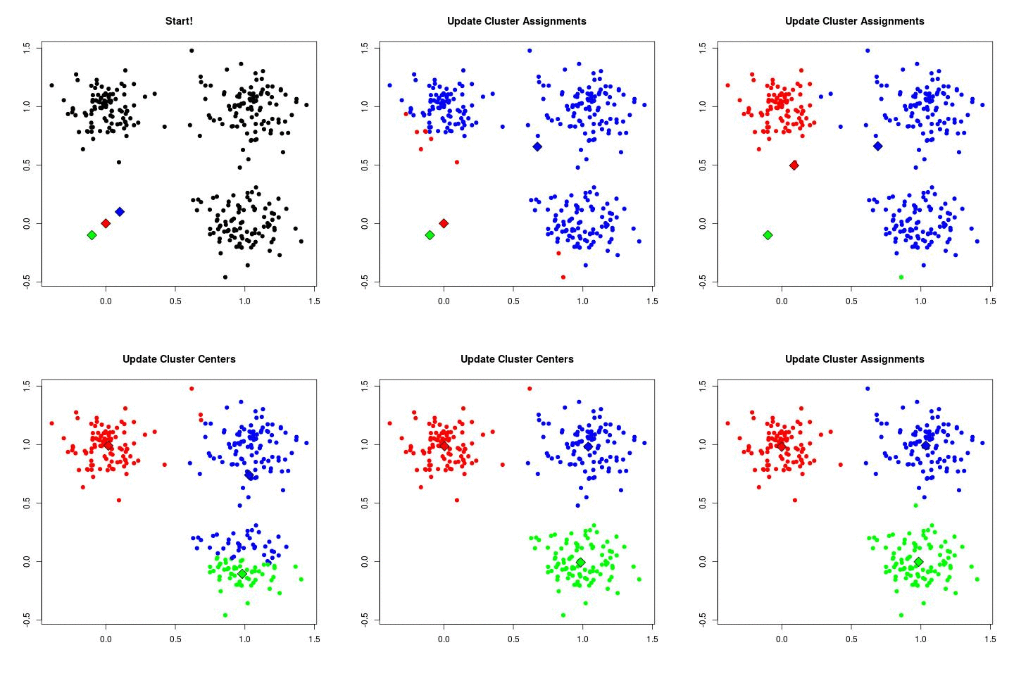
Now in the example above the three cluster centers start very close to each other. This typically does not work well as it will have a harder time finding clusters. Instead, you can use k-means++ to improve the initialization of the centers. It starts with an initial center and makes sure that all subsequent centers are sufficiently far away. This optimizes the selection and creation of centers.
You can then determine the optimal k clusters by using something called the elbow method. You want to find the point of diminishing returns when selecting a range of clusters. You can do this by plotting the number of clusters on the X-axis and the inertia (within-cluster sum-of-squares criterion) on the Y-axis. You then select k for which you find a bend:
import seaborn as sns
import matplotlib.pyplot as plt
from sklearn.cluster import KMeans
scores = [KMeans(n_clusters=i+2).fit(df).inertia_
          for i in range(10)]
sns.lineplot(np.arange(2, 12), scores)
plt.xlabel('Number of clusters')
plt.ylabel("Inertia")
plt.title("Inertia of k-Means versus number of clusters")
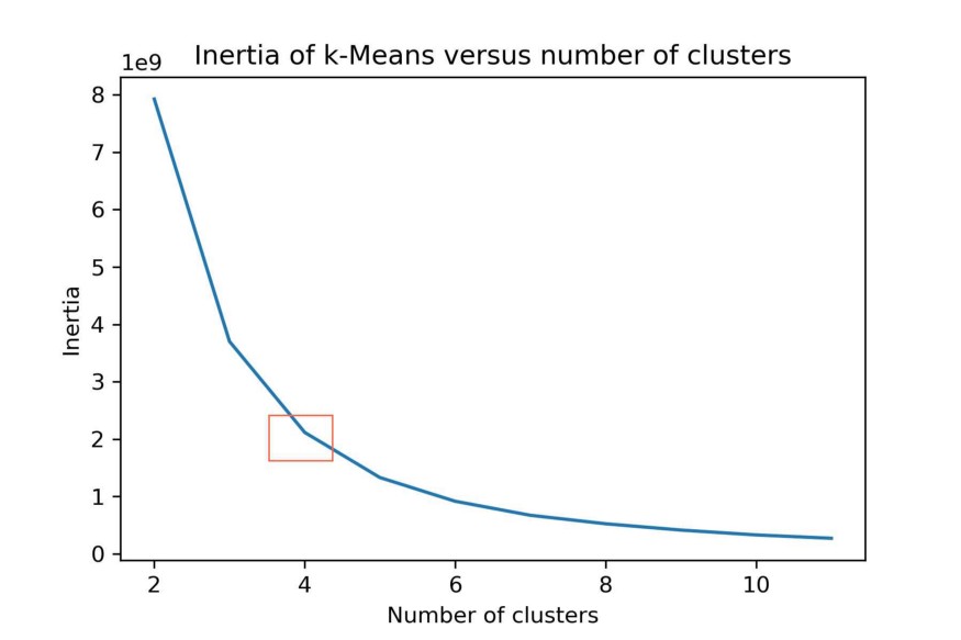
You can see the bend at the orange square. Thus, we selected k=4 clusters to be generated using k-Means.
One thing to note, since k-Means typically uses Euclidean distance to calculate the distances it does not work well with high dimensional data sets due to the curse of dimensionality. This curse, in part, states that Euclidean distances at high dimensionality have very little meaning since they are often very close together.
The data that we use is somewhat high dimensional since we have 27 features.
A solution would be to use the Cosine distance which works better in high dimensional space. Since Cosine distance and Euclidean distance are connected linearly for normalized vectors we can simply normalize our data.
from sklearn import preprocessing
normalized_vectors = preprocessing.normalize(df)
scores = [KMeans(n_clusters=i+2).fit(normalized_vectors).inertia_
          for i in range(10)]
sns.lineplot(np.arange(2, 12), scores)
plt.xlabel('Number of clusters')
plt.ylabel("Inertia")
plt.title("Inertia of Cosine k-Means versus number of clusters")
plt.savefig("intertia_cosine_kmeans.jpg", dpi=300)
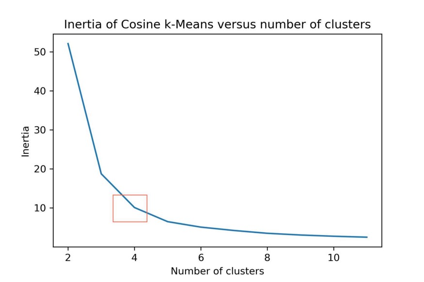
k-Means can be computationally quite expensive. Faster alternatives to this method are MiniBatchKMeans and BIRCH. Both methods are quicker to generate clusters, but the quality of those clusters are typically less than those generated by k-Means.
DBSCAN
Clustering can also be done based on the density of data points. One example is Density-Based Spatial Clustering of Applications with Noise (DBSCAN) which clusters data points if they are sufficiently dense. DBSCAN identifies clusters and expands them by scanning neighborhoods. If it cannot find any points to add it simply moves on to a new point hoping it will find a new cluster. Any points that lack enough neighbors to be clustered are classified as noise:
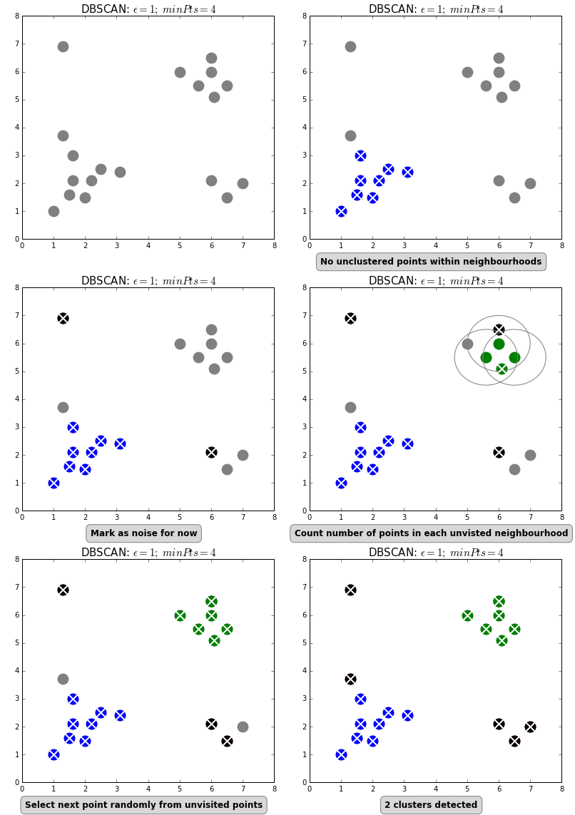
The difference with k-means is that DBSCAN does not require you to specify the number of clusters. The two main parameters for DBSCAN are the minimum number of points that constitute a cluster (minPts) and the size of the neighborhood (eps).
You typically do not want minPts to be very small as clusters from noise will be generated. As a rule of thumb, it is best to set minPts to at least the number of features in your data. eps is a bit more difficult to optimize and could require a k-distance graph to find the right value. Using small values is often preferred.
An alternative to DBSCAN is OPTICS, which has a similar performance to DBSCAN but does not explicitly need to set eps.
Evaluating Clusters
Next step is to perform the actual clustering and try to interpret both the quality of the clusters as well as its content.
Silhouette Score
To start evaluating clusters you first need to understand the things that make a good cluster. Although many definitions and methods exist for evaluating clusters, one of the most frequently used methods is calculating something called the Silhouette score.
The Silhouette score measures the separability between clusters based on the distances between and within clusters. It calculates the mean intra-cluster distance (a), which is the mean distance within a cluster, and the mean nearest-cluster distance (b), which is the distance between a sample and the nearest cluster it is not a part of, for each sample. Then, the Silhouette coefficient for a sample is (b - a) / max(a, b).
Let’s calculate the Silhouette Score for all previously mentioned methods:
from sklearn.metrics import silhouette_score
# Prepare models
kmeans = KMeans(n_clusters=4).fit(df)
normalized_vectors = preprocessing.normalize(df)
normalized_kmeans = KMeans(n_clusters=4).fit(normalized_vectors)
min_samples = df.shape[1]+1
dbscan = DBSCAN(eps=3.5, min_samples=min_samples).fit(df)
# Print results
print('kmeans: {}'.format(silhouette_score(df, kmeans.labels_,
                                           metric='euclidean')))
print('Cosine kmeans:{}'.format(silhouette_score(normalized_vectors,
                                          normalized_kmeans.labels_,
                                          metric='cosine')))
print('DBSCAN: {}'.format(silhouette_score(df, dbscan.labels_,
                                           metric='cosine')))

It is not a surprise to see that the cosine-based k-Means outperforms k-Means due to the amount of feature (27) that we have in the data. It is interesting to see that DBSCAN similarly performs well.
However, although objective measures are preferred I believe that when it comes to unsupervised clustering visually examining the clusters is one of the best ways to evaluate them. Never blindly follow objective measures. Make sure that you always inspect what exactly is happening!
Thus, next up are methods for visualizing clusters in 2d and 3d.
Visualizing Clusters
To visualize the clusters you can use one of the most popular methods for dimensionality reduction, namely PCA and t-SNE.
Principal Component Analysis (PCA)
PCA works by using orthogonal transformations to convert correlates features into a set of values of linearly uncorrelated features. What is left are features that contain the largest possible variance. For an in-depth overview of PCA see this article.
We can then visualize our data in 3d:
pca_df = prepare_pca(2, df, normalized_kmeans.labels_)
sns.scatterplot(x=pca_df.x, y=pca_df.y, hue=pca_df.labels,
                palette="Set2")
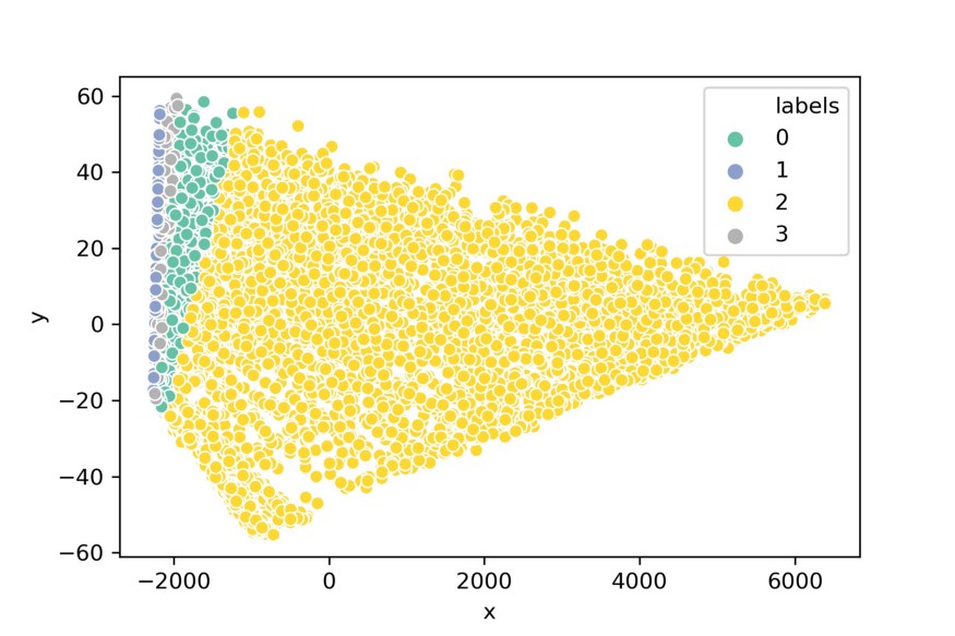
Although PCA might have been successful in reducing the dimensionality of the data, it does not seem to visualize the clusters very intuitively. This happens often with high dimensional data, they are typically clustered around the same point and PCA extracts that information.
Instead, we can use an algorithm called t-SNE which is specifically made to create an intuitive representation/visualization of the data.
t-distributed Stochastic Neighbor Embedding (t-SNE)
t-SNE is an algorithm for visualizing high dimensional data. It uses local relationships between points to create a low-dimensional mapping which results in capturing non-linear structures.
It starts by creating a probability distribution (i.e., Gaussian) which dictates the relationships between neighboring points. Then, it constructs a low dimensional space that follows that distribution as closely as possible using the Student t-distribution. Now you may wonder why it uses a Student t-distribution at this step. Well, a Gaussian distribution has a short tail which squashes nearby points together. If you use a Student t-distribution than the tail is longer and points are more likely to be separated.
Let’s implement t-SNE in 3d and see if we can better visualize the clusters:
tsne_3d_df = prepare_tsne(3, df, kmeans.labels_)
tsne_3d_df['normalized_kmeans'] = normalized_kmeans.labels_
tsne_3d_df['dbscan'] = dbscan.labels_
plot_animation(tsne_3d_df, 'kmeans', 'kmeans')
plot_animation(tsne_3d_df, 'normalized_kmeans', 'normalized_kmeans')
plot_animation(tsne_3d_df, 'dbscan', 'dbscan')

t-SNE gives a much more intuitive visual representation of the data. As can be seen in the animations, both cosine k-Means and DBSCAN seem to create logical clusters.
Interpreting Clusters
Now that we have segmented our customers it would be nice if we would know what makes each cluster unique. This will help us understand which types of customers we have.
One approach is to simply plot all variables and see where the differences are between clusters. This approach, however, fails when dealing with more than 10 variables as it would be difficult to visualize and interpret:
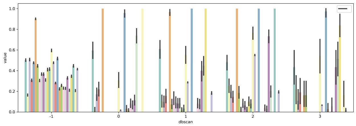
The solution would be to select a subset of variables that, to a certain extent, are important when defining clusters. There are two methods that I want to demonstrate here, namely variance between averaged groups and extracting feature importance through predictive modeling.
Variance within variables and between clusters
One assumption of variable importance in cluster tasks is that if the average value of a variable ordered by clusters differs significantly among each other, that variable is likely important in creating the clusters.
We start by simply aggregating the data based on the generated clusters and retrieving the mean value per variable:
from sklearn.preprocessing import MinMaxScaler
scaler = MinMaxScaler()
df_scaled = pd.DataFrame(scaler.fit_transform(df))
df_scaled['dbscan'] = dbscan.labels_
df_mean = (df_scaled.loc[df_scaled.dbscan!=-1, :]
                    .groupby('dbscan').mean())

Groupby of clusters generated by DBSCAN averaged per variable
I ignored the -1 cluster since that is defined as noise by DBSCAN. The data were scaled between 0 and 1 for easier visualization.
Next, I simply calculate the variance of means between clusters within each variable and select the top 7 variables with the highest variance:
results = pd.DataFrame(columns=['Variable', 'Var'])
for column in df_mean.columns[1:]:
    results.loc[len(results), :] = [column, np.var(df_mean[column])]
selected_columns = list(results.sort_values(
        'Var', ascending=False,
    ).head(7).Variable.values) + ['dbscan']
tidy = df_scaled[selected_columns].melt(id_vars='dbscan')
sns.barplot(x='dbscan', y='value', hue='variable', data=tidy)
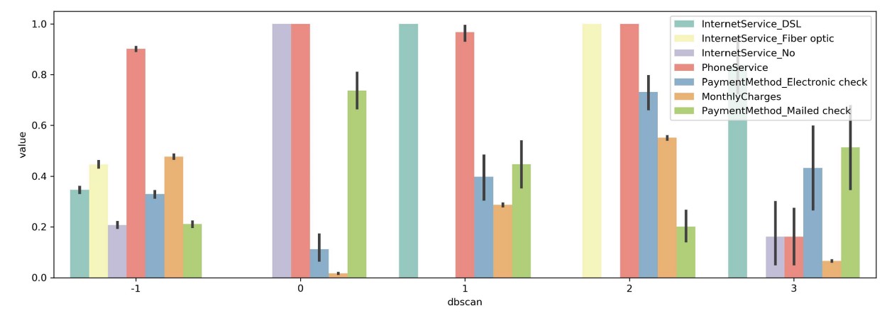
You can now more clearly see differences between clusters. For example, in cluster 0 you can see that every single person has no Internet service while most other clusters contain those with Internet service. Moreover, we can see that cluster 2 contains only people with both Fiber optic and Phone services which implies that those are either bought together are of the same package.
NOTE: I did not take standard deviation, skewness, and kurtosis into account which is important in comparing variables. The method above is simply the first step in selecting variables.
Random Forest Feature Selection
Lastly, we can use the clusters as a target variable and then apply Random Forest to understand which features are important in the generation of the clusters. This method requires a bit more work since you will have to check the accuracy of your model to accurately extract important features.
In this example I am going to skip that step since we are dealing with imbalanced targets and multiple classes:
from sklearn.ensemble import RandomForestClassifier
X, y = df.iloc[:,:-1], df.iloc[:,-1]
clf = RandomForestClassifier(n_estimators=100).fit(X, y)
data = np.array([clf.feature_importances_, X.columns]).T
columns = list(pd.DataFrame(data, columns=['Importance', 'Feature'])
           .sort_values("Importance", ascending=False)
           .head(7).Feature.values)
tidy = df_scaled[columns+['dbscan']].melt(id_vars='dbscan')
sns.barplot(x='dbscan', y='value', hue='variable', data=tidy)

We can see that similar features are selected when comparing to the variance analysis that we did before. Since this method requires a bit more work in the form of validation I would suggest using the variance method described before.